Piece Map
A small copy of the wheel, turning as yours turns, with the next five pieces on the lanes where they will land. The outlined one falls first, so you can plan your spin ahead.


I'm Victor, an iOS developer in Sydney. I design and build apps end to end, with AI as my coding partner. Two are live on the App Store, and a third is on the way.
For Australian tradies
Talk, snap or type. A tax invoice comes out.

A circular puzzle · iPhone, iPad, iPhone Duo
Spin the core. Match colours. Chain combos.

Your dog in 3D · iPhone, iPhone Duo, Apple Watch
Your real dog, in 3D. Real care levels them up.
Case 01 · Live since 29 Aug 2026
Australian tradies lose hours a week to paperwork: carbon-copy invoice books, GST worked out by hand, chasing bank details.
Invoice Studio turns a voice note, a photo of a quote or a blank page into a ready-to-send tax invoice. GST is calculated automatically, and PayID details go straight onto the invoice so the client knows how to pay.
It started as a web app on 29 May 2026 and reached the App Store on 29 August: one codebase, two payment systems (Stripe on the web, StoreKit on iOS) and no front-end framework underneath. On iPhone Duo it fills the whole device in every position.
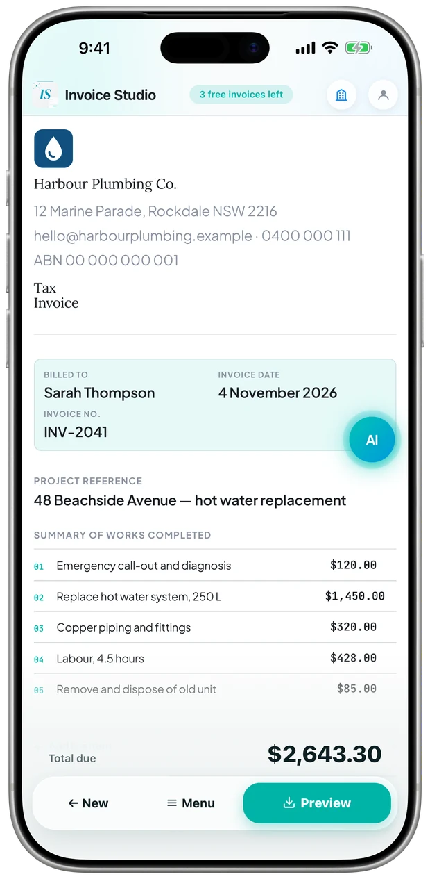
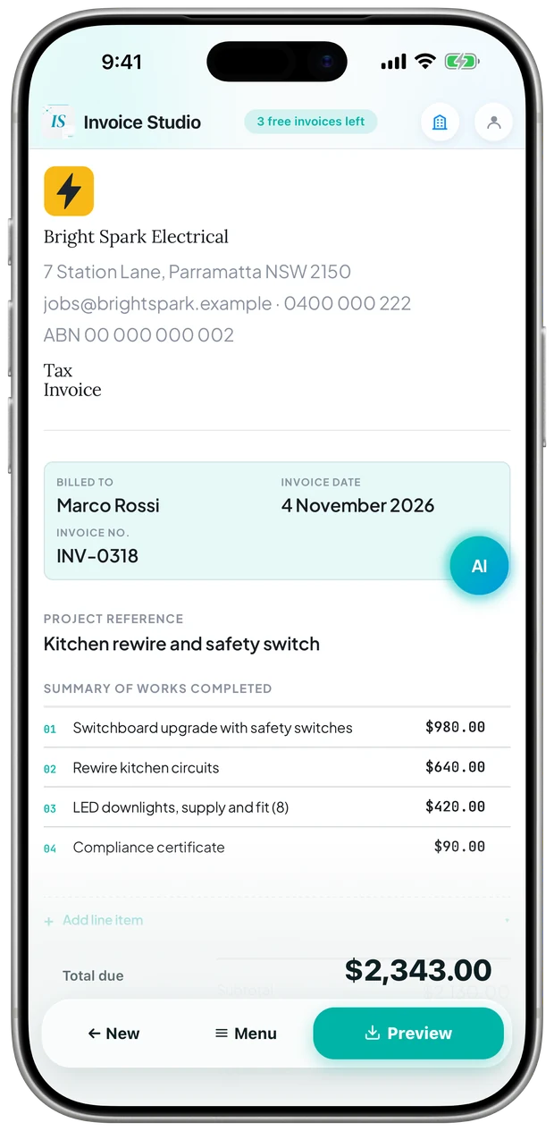
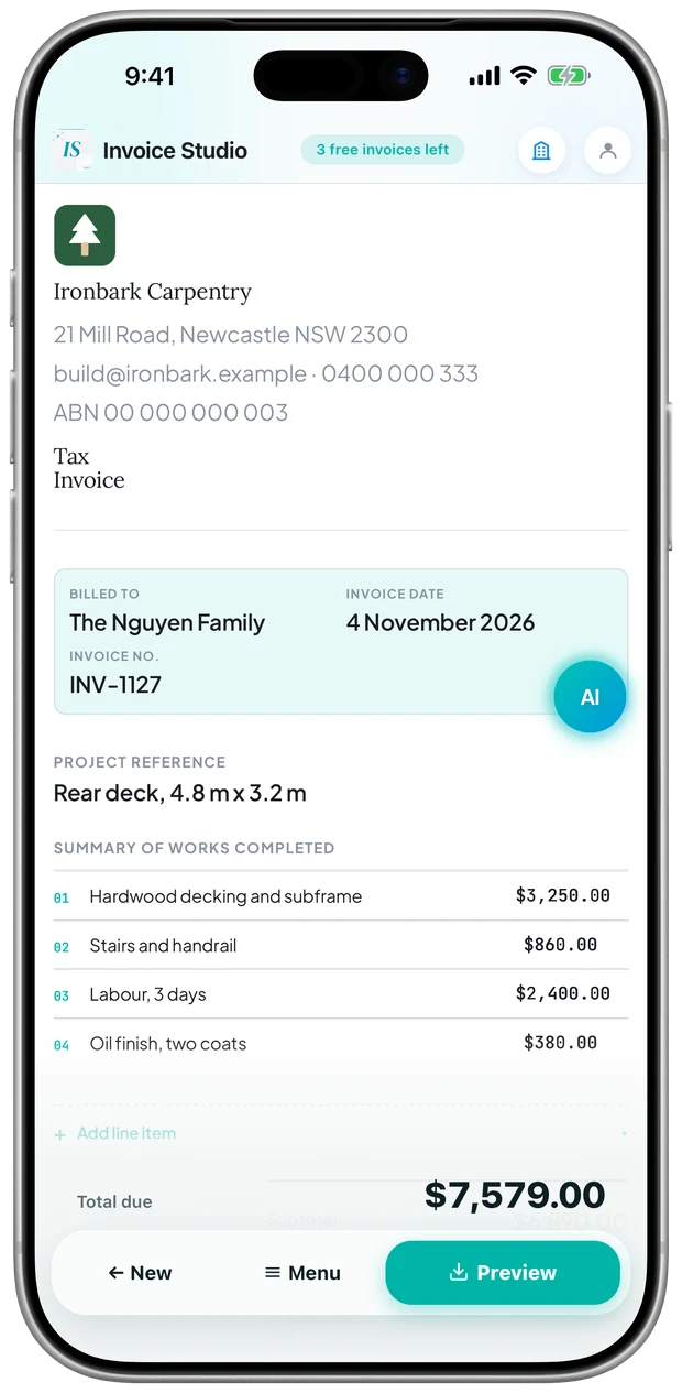
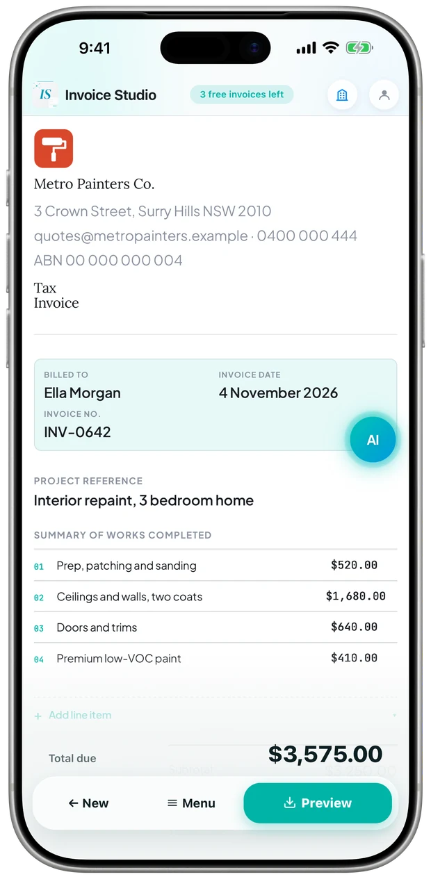
Real app screens. The businesses are examples.
iPhone Duo
A tradie opens the Duo on a bonnet or holds it closed in one hand. So the app has a layout for each position, and nothing important ever sits on the fold.
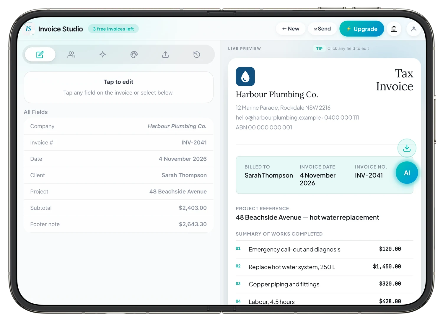
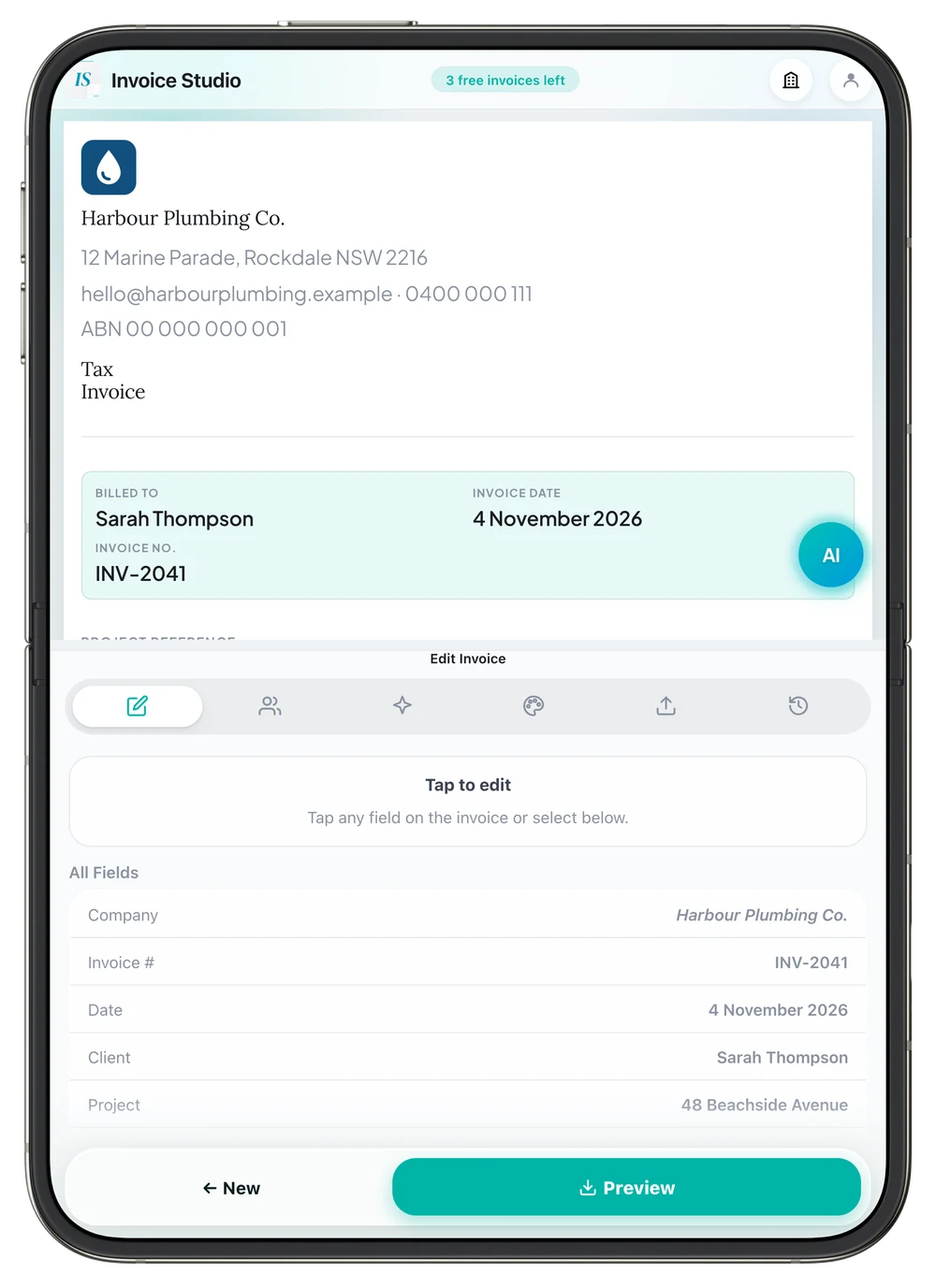
The fold falls exactly between them. Tap a field on the right and its editor opens on the left, so nothing covers the invoice.
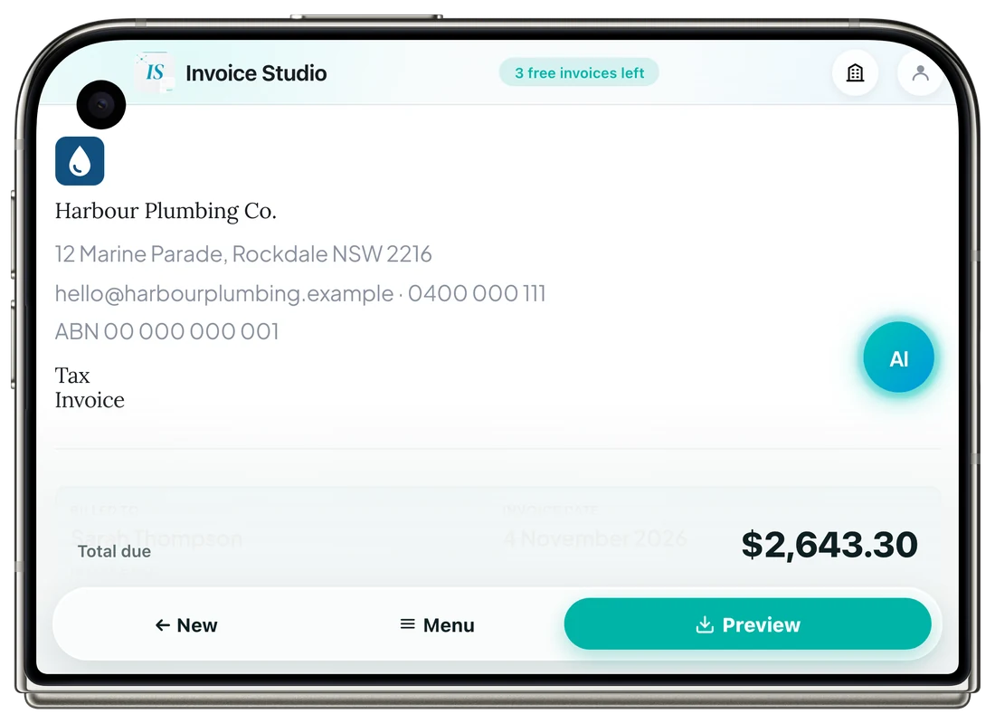
Half-fold it on the ute's bonnet and the invoice stands up while you work the bottom half.
The invoice takes the width, with the actions in a slim floating bar.
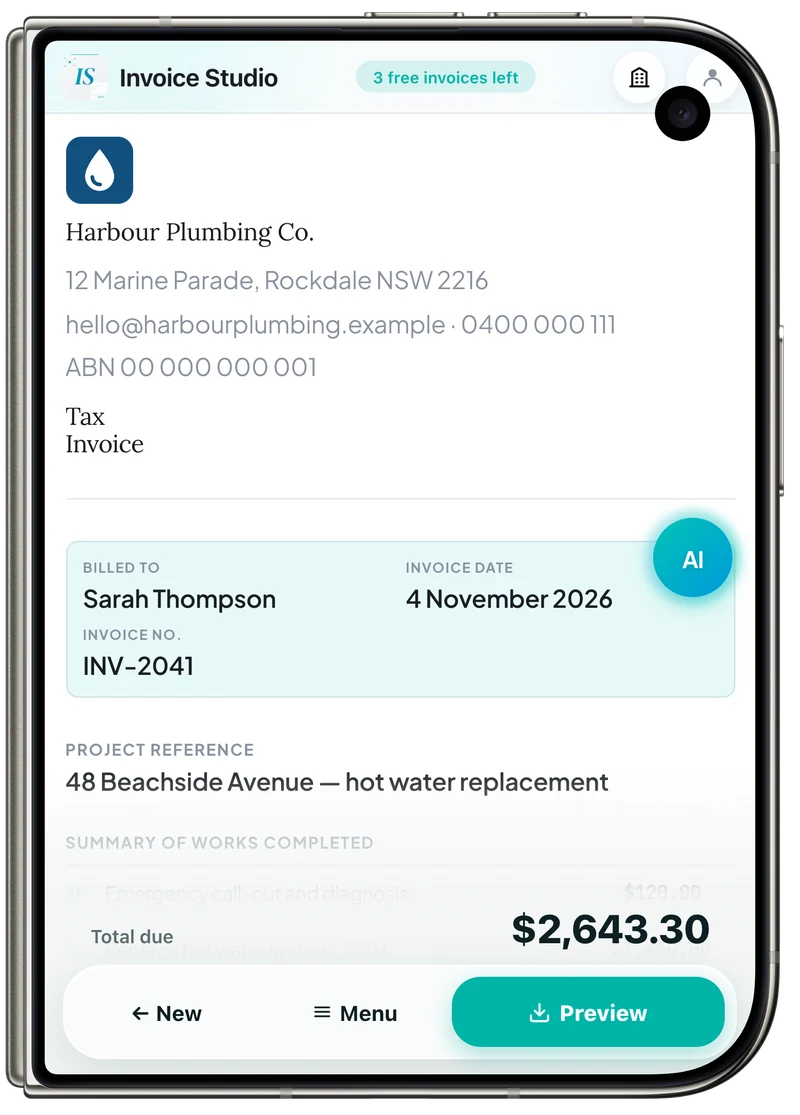
The phone layout, with the header and buttons kept clear of the camera.
Screens are real captures at each position's exact size, set into Apple's official device frames.
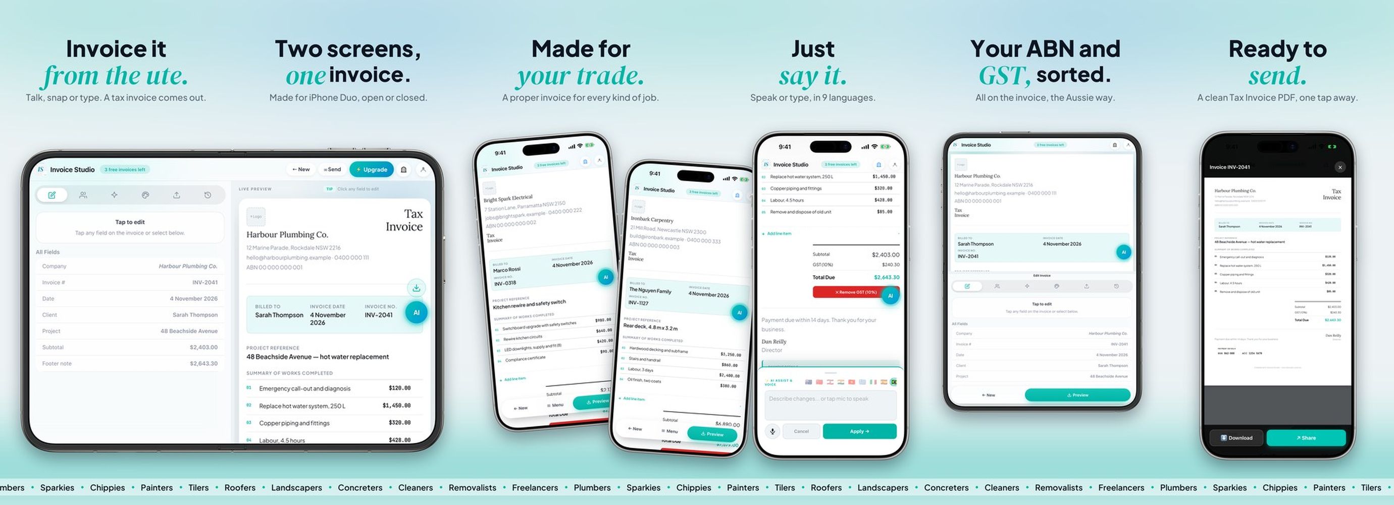
Swipe through them: the App Store screenshots run as one continuous artwork, with the Duo's fold on the first gap.
One web codebase with no front-end framework, inside a native iOS shell, with Apple's frameworks where the phone does the work.
The whole editor is plain HTML, CSS and JavaScript, shared by the web and iPhone.
The native iOS shell. It bridges the web app to the camera, files, share sheet and haptics.
Voice commands run on Apple's SFSpeechRecognizer, in nine languages.
iPhone subscriptions through RevenueCat, with Stripe on the web and one account across both.
Apple, Google or email, with accounts and sync on Supabase.
Reads a plain-English job or an old invoice and fills in the fields, through my own Node.js server.
A server renders the same PDF from any device, and PDF.js gives a pinch-to-zoom preview inside the app.
Scripted runs check the main flows on phone and desktop, and compare the PDF payload byte for byte before a release.
It took three App Store review rounds. Every rejection was about a compliance detail, like a screen-recording permission or a link to the subscription terms, and never about the product. Since then I get the legal details right before the first submission, because they cost more time than any feature.
Case 02 · Live since 23 Oct 2026
Pieces fall inward toward a rotating core instead of stacking in a grid. You spin the core, match colours and chain combos before it fills up.
It's built 100% native in SwiftUI and SpriteKit, with no game engine and no web wrapper. The circular loop has relatives, like Hextris. What's new is the layer on top: a live global leaderboard, share cards where no two are alike, and a signature move where you swipe up on a fully aligned ring to clear it.
It's free to play. Players can watch an optional rewarded video from Google AdMob to earn coins, buy coin packs, or take the Premium monthly subscription, which gives coins every month and removes all ads. Ads only play when the player taps to watch one, and there are never banners.
On iPhone Duo it fills the whole device in every posture: the wheel on one half, a live panel with the Piece Map and your score on the other.
The idea for the mechanic came from a dream. Everything after that was rounds and rounds of design.
Real screen recording of a match, played by the game's own test bot. Built 100% native in SwiftUI + SpriteKit.
iPhone Duo
A foldable isn't a bigger phone. Both of its screens are close to square, the inner one has a crease, and you can turn it any way you like. So Wirlo doesn't stretch one layout to fit: it has a layout for each posture, and it fills the screen in all of them.
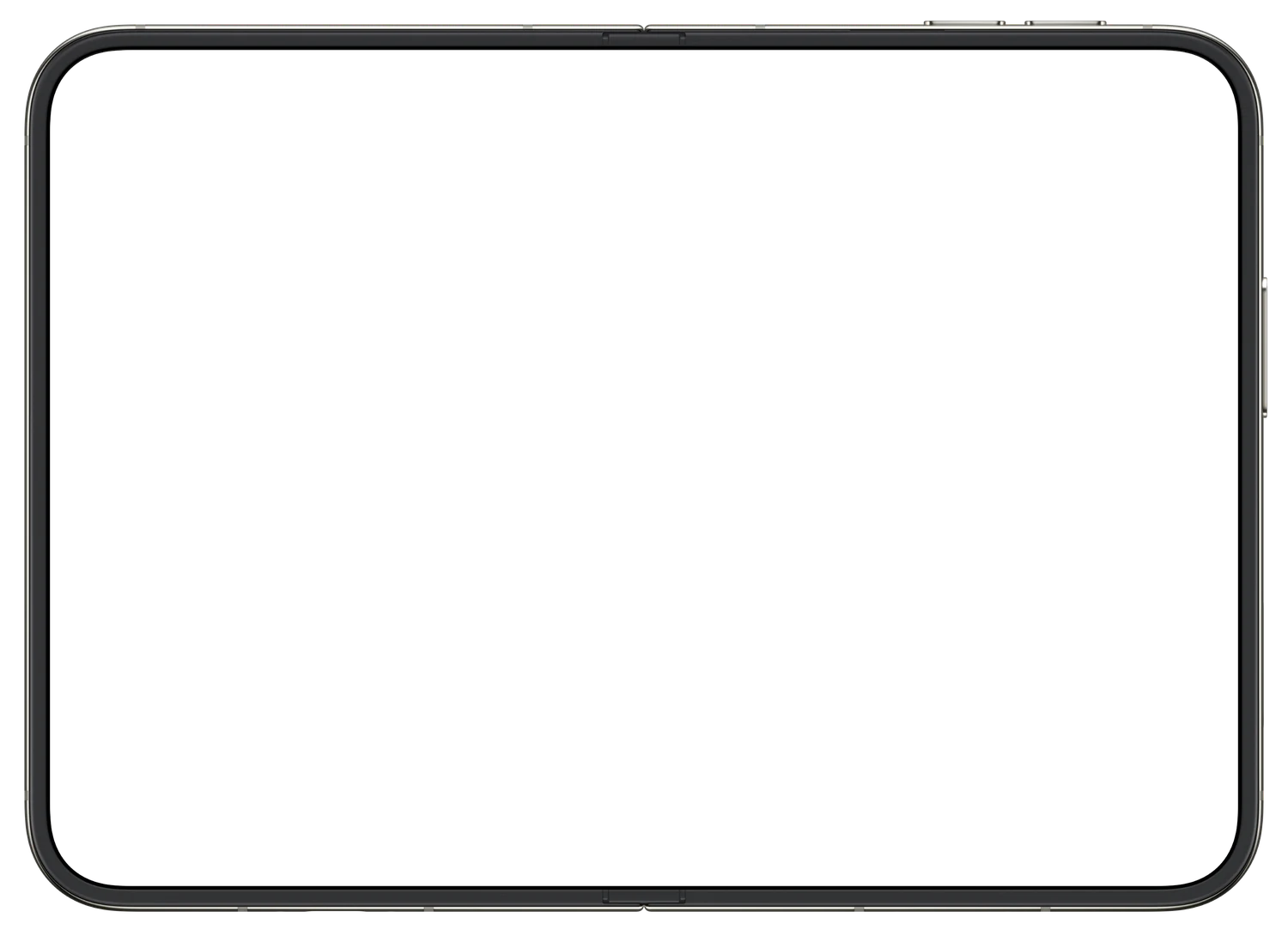
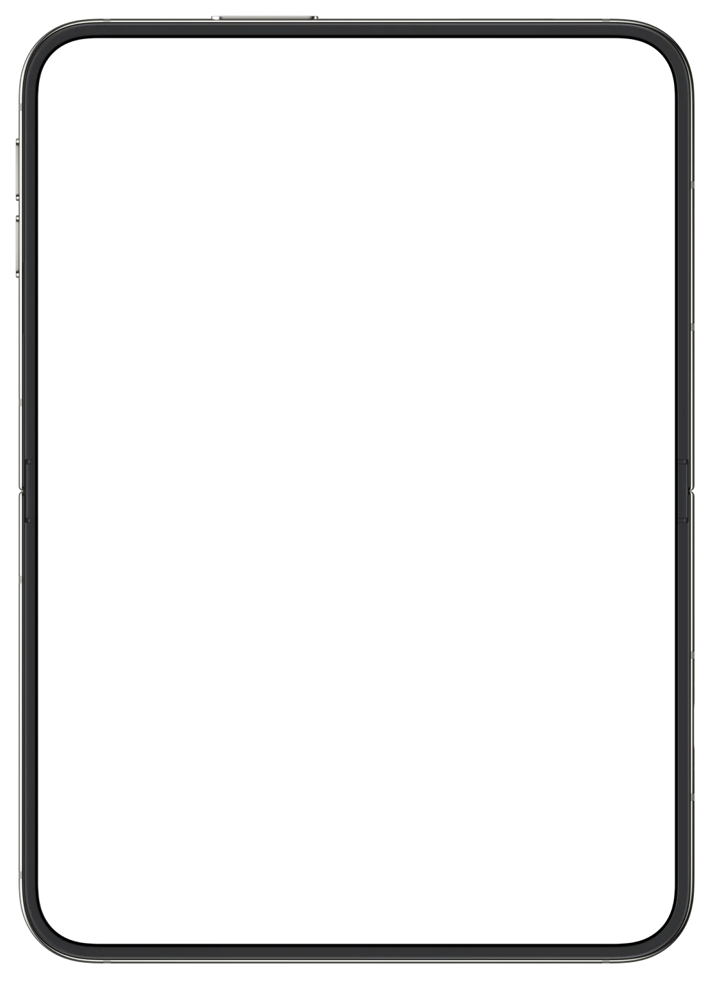
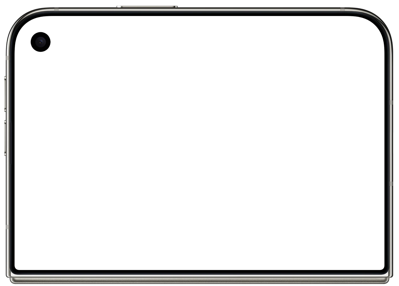
The wheel gets the left half, the live panel the right. Nothing important ever sits on the fold, and tapping anywhere still spins the wheel, so you play with two thumbs.
Half-fold it and the top half stands up like a small console, with the score and the Piece Map in your hands. The same layout works flat or in that L shape.
A narrow column keeps the score, the Piece Map and the value of your next hit, so even the small screen on its side feels designed for it.
The wheel stays centred, with the next pieces in a slim strip below it. Menus and cards are placed so the sensor area never covers a button.
Real gameplay, recorded from the game running on the iPhone Duo simulator and played by its test bot.
A small copy of the wheel, turning as yours turns, with the next five pieces on the lanes where they will land. The outlined one falls first, so you can plan your spin ahead.
A scoring layer on top of the combo. Close slices of three different colours and the whole wheel throws sparks for +450. You choose which colours to chase.
On a regular iPhone or iPad the next four pieces sit in a slim strip. Everyone plays with the same information, so the global leaderboard stays fair across devices.
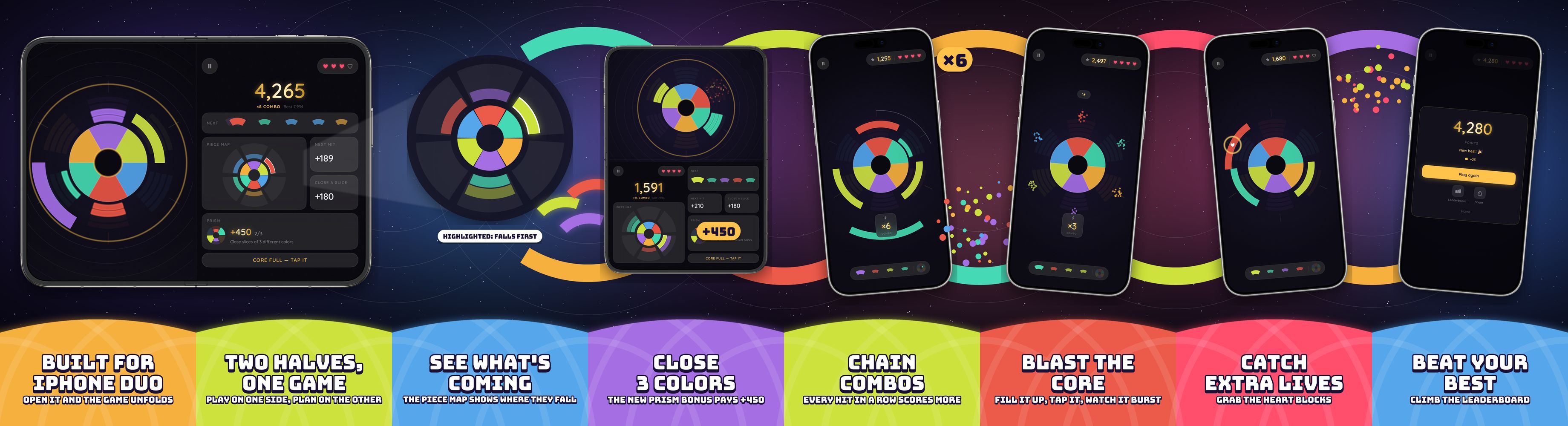
Swipe through them: the App Store screenshots are one continuous artwork, and the fold of the iPhone Duo lands exactly on the gap between the first two.
Fully native, on Apple's own frameworks. No game engine and no web view: about 12,900 lines of Swift, built with AI as my coding partner.
The game itself: the wheel, the falling arcs and the particles, all drawn from code, with no image assets, on a per-frame update loop.
Home, HUD, panel and every menu. The Piece Map and the mini wheel are drawn live with Canvas.
AVAudioEngine synthesises every sound in real time. There isn't a single audio file in the app.
Global leaderboard and achievements through Game Center.
Coin packs, remove-ads and the Premium subscription, using Apple's in-app purchases.
The coin balance follows the player across devices and reinstalls, with conflict handling.
The orbiting pieces on the home screen shift with the tilt of the device.
UI tests tap every posture for real, including a full grid of the screen, while a bot plays whole matches.
// iOS 27.1: ask the system where the fold is.
if #available(iOS 27.1, *) {
    fold = proxy.reservedRegions(kind: .division)
        .first(where: \.isActive)?.frame
}
// Pure function: screen, insets and fold in, layout out.
static func make(size: CGSize, insets: UIEdgeInsets,
fold: CGRect?, isPhone: Bool) -> ArenaLayoutA casual game for everyone is a different discipline from a tool for a niche. Every decision was tested against one question: would a total beginner get this in 10 seconds?
I built a bot that plays whole matches. The first Prism rule asked for one closed slice of every colour in play, and in its matches the bonus never paid, because new colours arrive faster than slices close. No screenshot would have shown that. The rule became three different colours, and it paid.
Case 03 · Coming soon to the App Store
Real app, recorded on the iPhone Duo, iPhone and Apple Watch simulators with sample dogs. Fold positions are scripted for the recording.
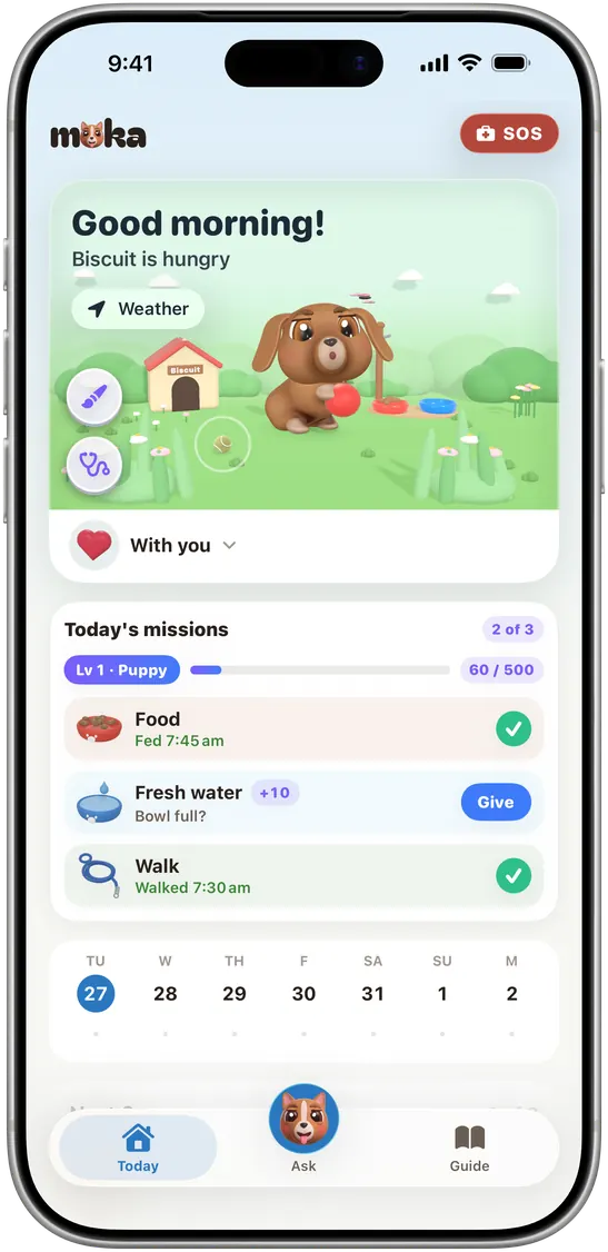
One photo becomes a clay 3D dog that lives the care you really give. The food, the water and the walk you do in real life turn into missions and XP.
It's built native in SwiftUI and RealityKit, with no game engine. Around the dog there's a full care app: "can my dog eat this?" in one tap, first aid for your country that works offline, vaccines, weight, training, a shared family and a chat that knows your dog.
iPhone. Real screen recording: the dog is live 3D.
Home Screen
Your dog sits on the Home Screen and tells you what's next. A walk runs in the Dynamic Island while the phone is in your pocket.
Apple Watch
A real watchOS app. Pet the dog and the hearts float up. Tap once to log the walk, and it's on the iPhone too.
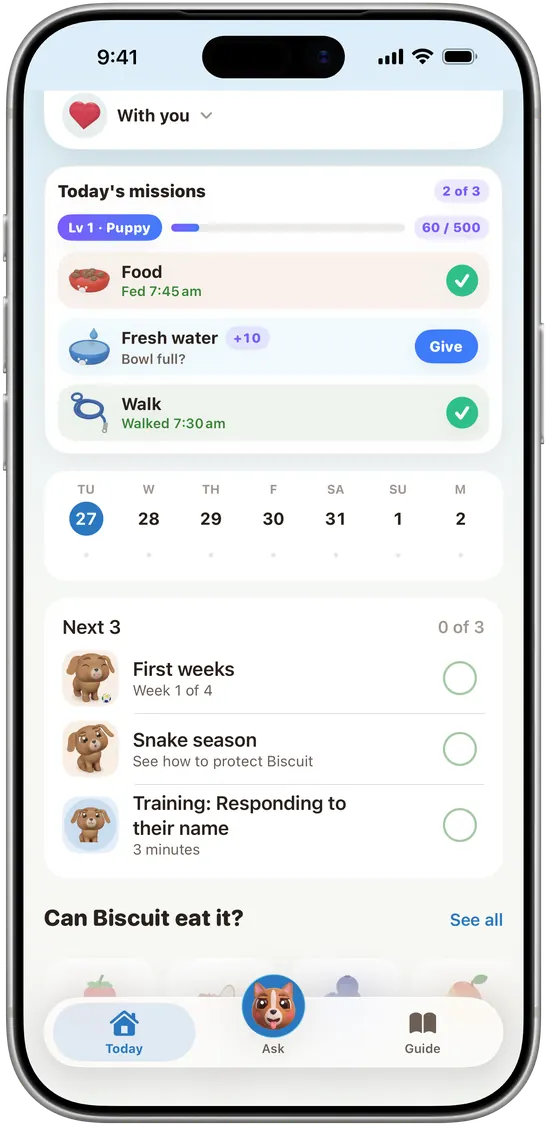
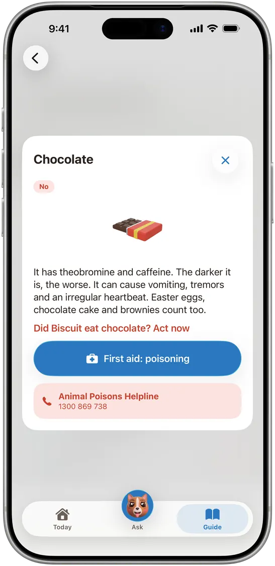
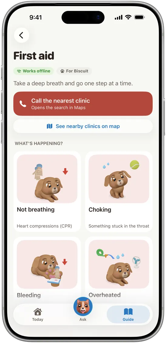
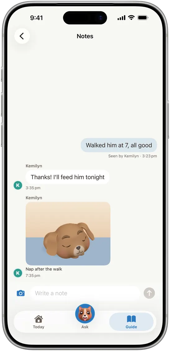
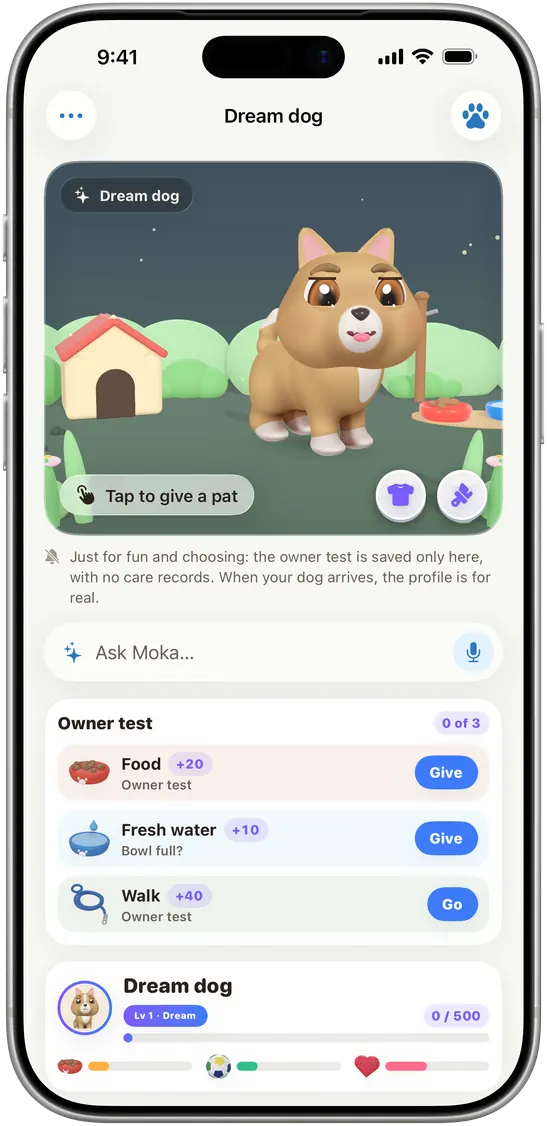
The 3D dog brings people in, but care is why they stay. So I set a rule: play leads to care, care beats play, and there's no play on serious screens like first aid.
Design
Before any code, I design every screen and test it against real use. Here is why the apps look the way they do.
Wirlo · Identity and game design
"Nothing may require interpretation. A coin is a coin. Continue is continue."
Many Wirlo players aren't gamers. There is no text tutorial: the first match is the tutorial. Hints react to what you do, never before, and each one shows only once. The main button has to be readable in under a second, and every touch target is at least 44 points.
On a foldable, a line runs through the middle of the screen. Instead of hoping nothing lands on it, the layout is built around it: the system reports where the fold is, and the wheel and the panel each take one side. Pause and game-over cards open in the panel half, so the wheel stays in view.
The "W" isn't a letter from a font. It's four coloured strokes with round caps, tilted 10°, and the last one sits higher. The gaps stand for the piece that hasn't snapped in yet.

The brand colours are vivid. In the game they're desaturated by 12% so they don't glow against the dark background after twenty minutes of play.
Quicksand replaced Poppins and the system font. Four weights cover all 10 languages with no fallback font.
There isn't a single audio file. Every sound is synthesised live on one pentatonic scale, so it all sounds like one instrument, and the hit sound rises as your combo grows. There's one gentle haptic tap per meaningful event and nothing on every frame. Animation follows the iPhone's own Reduce Motion setting.
The game was designed as an HTML prototype first. The approved prototype became the contract for the native build.
Good design is also what you remove.
Invoice Studio · Brand and invoice design
The interface uses calm greys and a single teal accent, so the tradie's own invoice is the colourful thing on screen. Colour themes apply only to the invoice and its PDF, never to the app around it.
Each layout fits a different kind of business, from a formal accountant to a bold, modern trade.
A clean sans for the interface, an italic serif so a company name feels like a signature, and a monospace font so every dollar lines up.
Every Instagram post comes from one fixed template: the same grid, colours and type in every post. A bold headline with its second line in teal, an italic serif subtitle, and white cards on a soft grid. The Reels follow the same rules, with no emoji. Consistency is what makes a small brand recognisable.
About
 I wrote my first line of code in February 2026. I have no CS degree and didn't do a bootcamp. I learned with AI as a coding partner, over nights and weekends after a full-time day job.
Since then I've shipped Invoice Studio and Wirlo end to end, and Moka is on the way. I'm not a "no-code" story: these are real native apps, I make every product and design call, and when something breaks at 11pm I'm the one sorting it out. Vikta is what I'm building while I learn, in public, one shipped product at a time.
Got an app idea, a role on your team, or an interest in backing what I'm building? Tell me about it. I read every message myself.